Why Colour Is One of the Most Powerful Tools in Your Brand

When people think about branding, they often think about logos first. But designers know the real secret weapon is colour. Colour works quietly in the background, shaping how people feel about your business before they even read a single word.
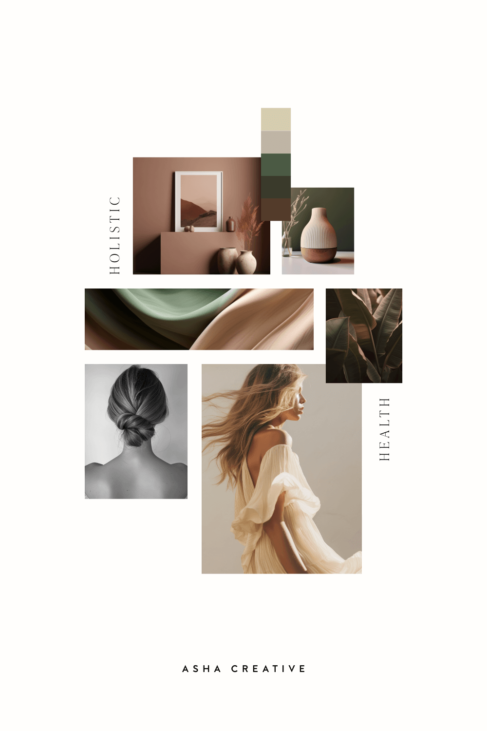
Colour communicates emotion instantly. Soft neutrals feel calm and refined. Deep blues create trust and professionalism. Warm terracotta or mustard tones can feel creative and grounded. The palette you choose becomes the emotional shorthand for your brand.
For small businesses especially, colour consistency builds recognition. When your website, social media and marketing materials all share the same palette, customers begin to associate those colours with your brand automatically.
Marketing leaders often emphasise that branding is really about perception. As entrepreneur Ashley Friedlein explains:
“Brand is the sum total of how someone perceives a particular organization.”
That perception begins visually. The colours you choose influence how people feel about your business — whether they see you as professional, creative, calming or energetic.
For small businesses trying to stand out in crowded markets, colour becomes a powerful differentiator. Research into branding shows that strong visual identities help businesses stand out and increase brand recognition and trust.
FINAL THOUGHTS
Choosing your brand colours isn’t just a design decision — it’s a strategic one. The right palette tells your audience who you are before you’ve even introduced yourself.